FinHive
The problem
Fintech apps live or die by trust. If the interface feels cluttered, inconsistent, or unclear about what it's doing with someone's money, users leave. FinHive needed a UI that could surface financial data without overwhelming people — something that felt competent and legible at a glance, not a wall of numbers.
My role
UI/UX design only. I worked entirely in Figma: user flows, wireframes, component design, and a final spec ready for handoff to engineering. No frontend code was written as part of this engagement — the Figma file is the deliverable.
Key decisions
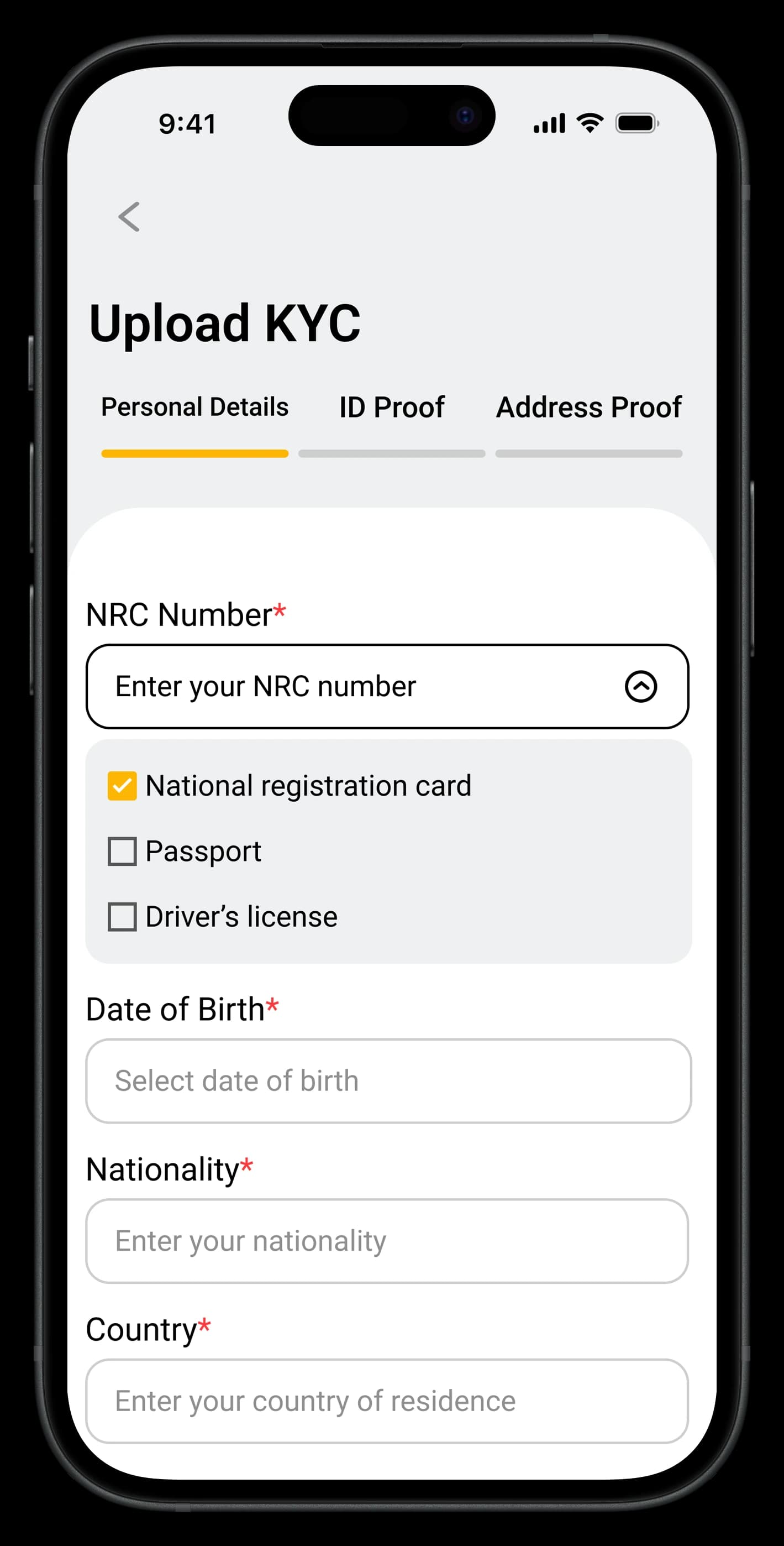
Onboarding flow. Stripped to the minimum steps needed to get a user to value. Each screen has one job. Progress indicators show users how close they are to done — a small thing that measurably reduces abandonment on multi-step flows.
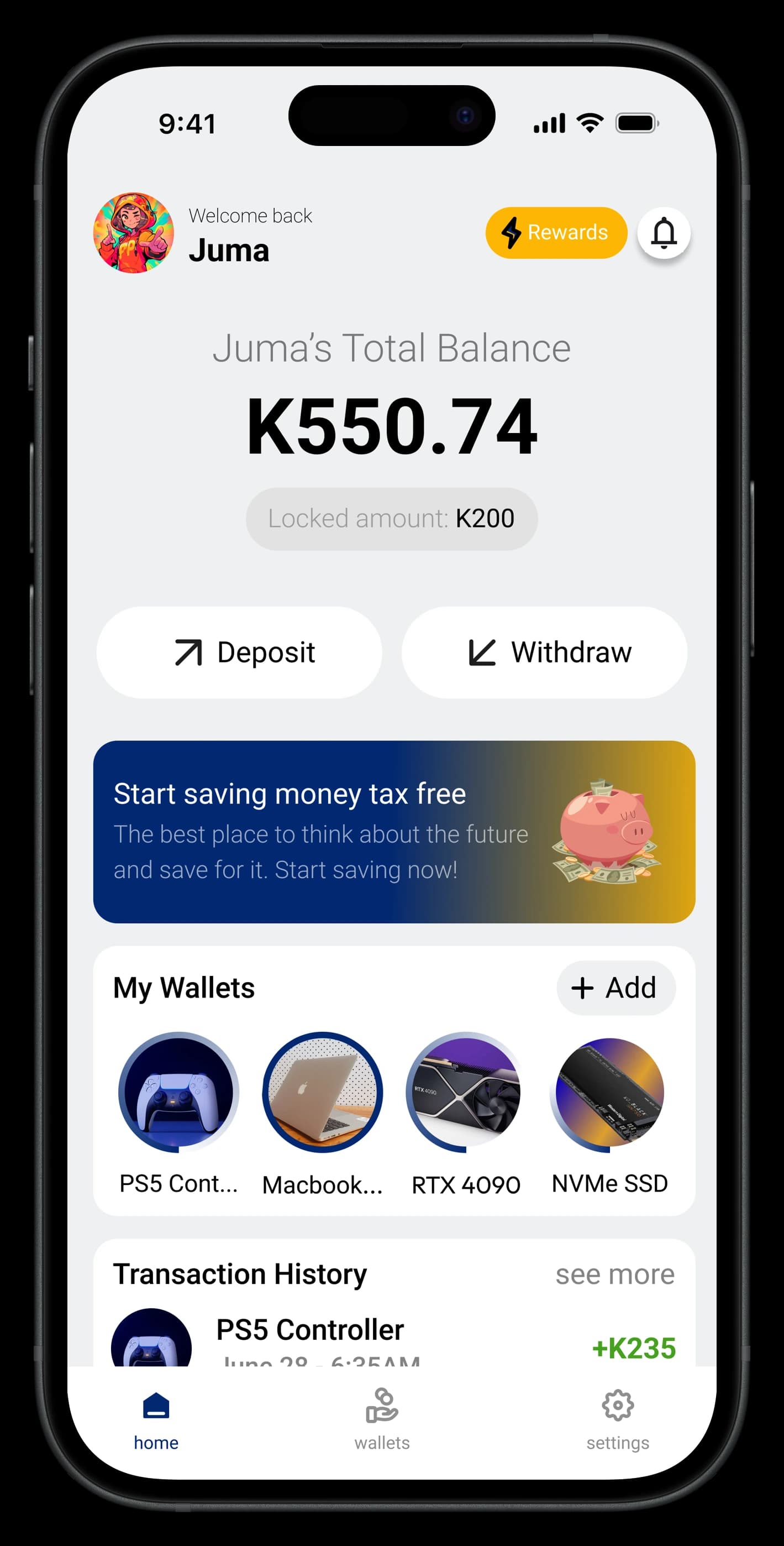
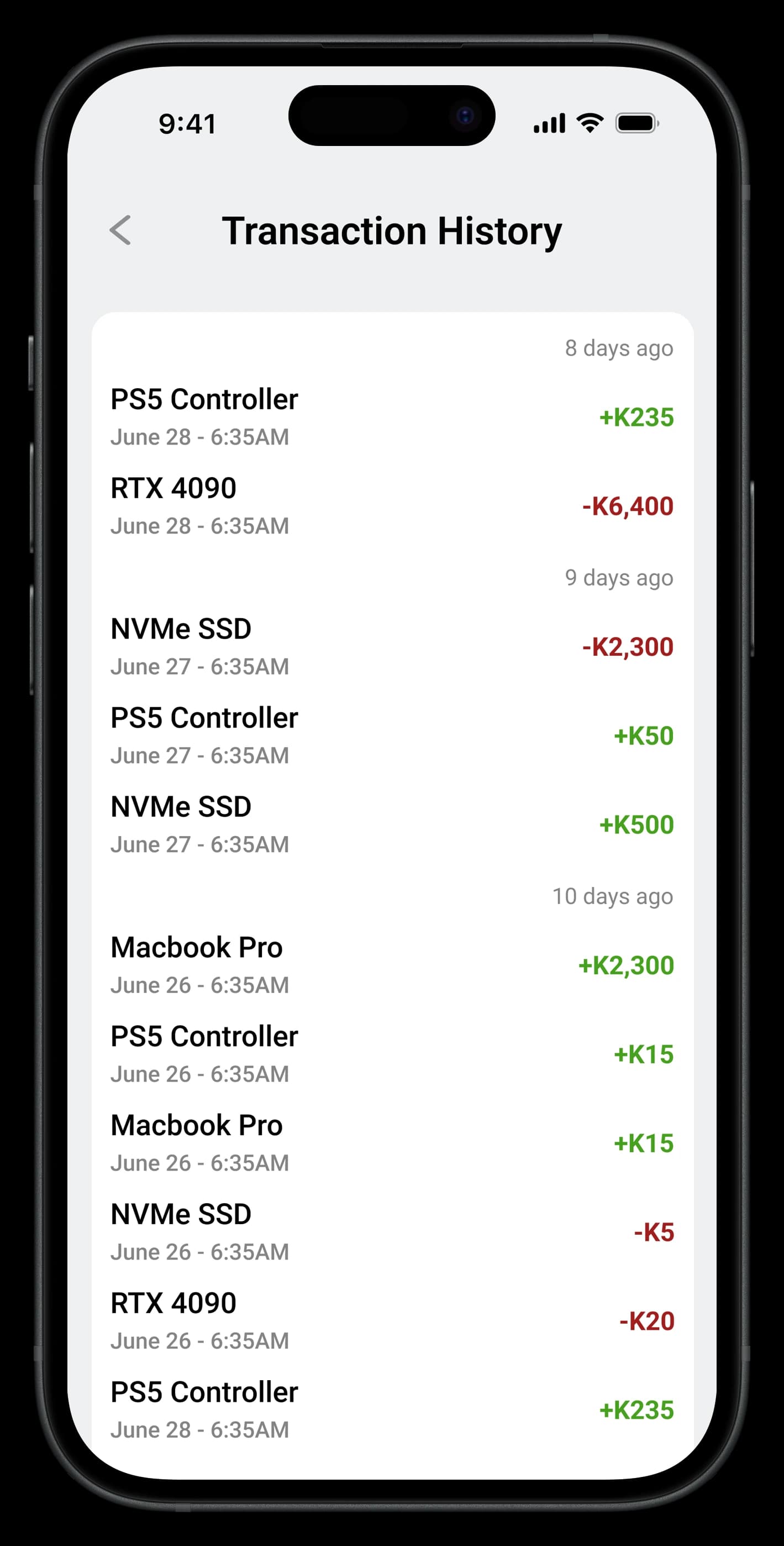
Data density and trust signals. Financial screens need to show a lot of information without feeling like a spreadsheet. I used a tiered hierarchy: primary figures large and prominent, secondary data accessible but not competing. Consistent iconography and explicit status labels ("Pending", "Completed", "Failed") mean users always know what state they're looking at — no guessing.
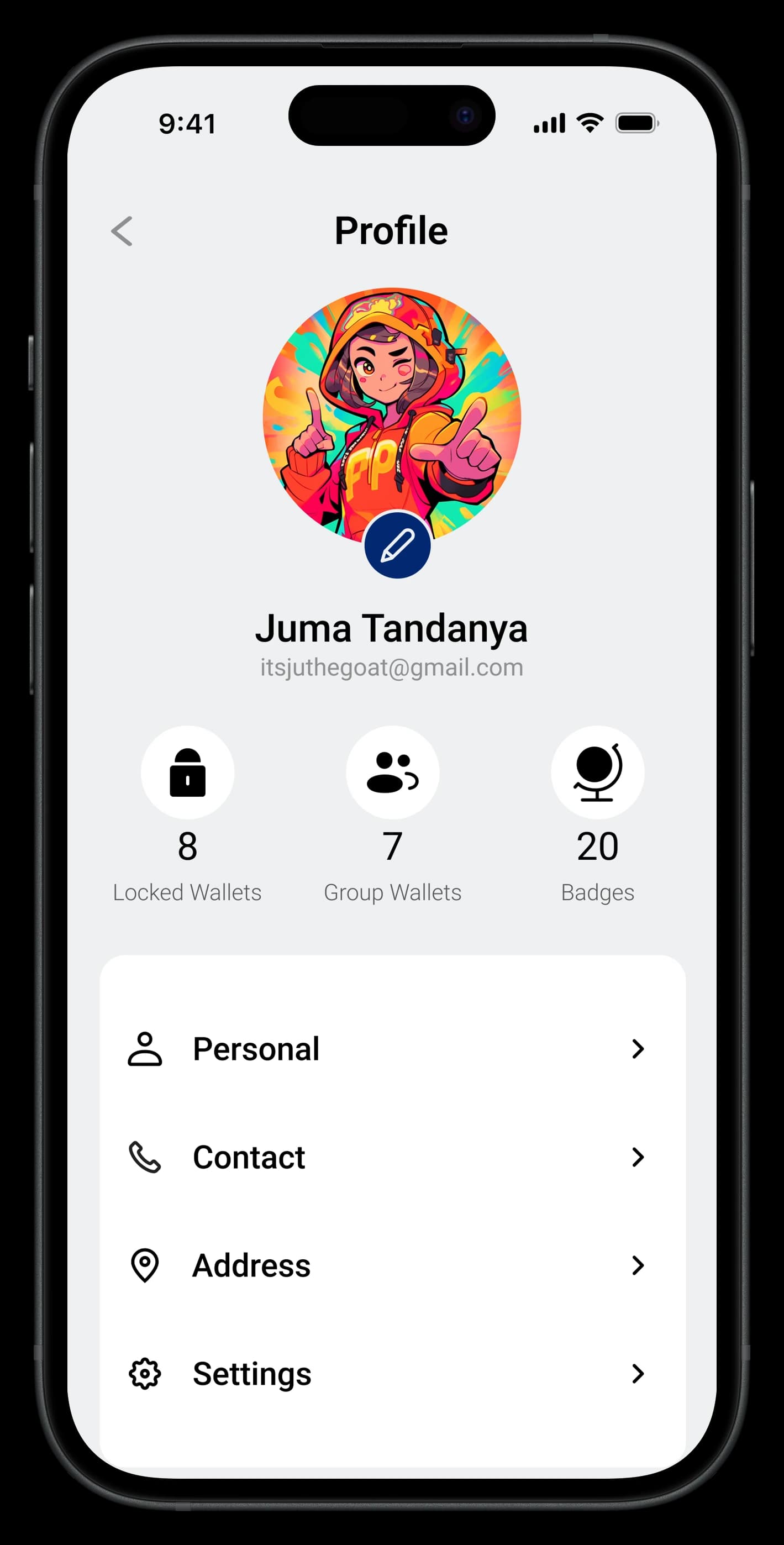
Navigation structure. Bottom tab bar covers the primary actions users return to daily. Account and settings sit in a persistent top-right affordance. Nothing is buried more than two taps deep.